In the past few years, Google has been pushing for websites to be mobile-friendly, even to the point of penalizing your website search results and listing rankings if your website does not meet their mobile-friendly requirements. Most of this demand was due to the massive increase of mobile phone searches, even surpassing desktop usage in recent years.
Google announced its “Mobile First Indexing” on April 21st, 2015, and would be set as a permanent default on all new website submissions starting on July 1, 2019. (Ref. https://developers.google.com/search/mobile-sites/mobile-first-indexing) This means that they started indexing all websites based on its mobile-friendly compatibility rather then the desktop version that they originally done in the past. This update came when mobile searches started becoming the majority and desktop searches were becoming the minority.
Moreover, according to Statista (Ref. https://www.statista.com/statistics/277125/share-of-website-traffic-coming-from-mobile-devices/) mobile devices (excluding tablets) generated 52.6 percent of global website traffic in the fourth quarter of 2019, consistently hovering around the 50 percent mark since the beginning of 2017. This meant website developers and companies would need to take time to ensure they are providing mobile users the best experience possible when visiting their websites.
Lets face it! Google is all about search and data. Google has always aimed to increase the largest number of searches possible. So with the mobile increase and mobile searches on the rise, they were forced to adapt to the most popular means of search results. So, will a non-mobile-friendly website hurt my rankings and traffic? Well, since 2015, in what search engine optimizers have dubbed “Mobilegeddon” (Ref. https://en.wikipedia.org/wiki/Mobilegeddon), Google officially started rewarding the search rank of mobile-friendly sites while penalizing sites that were not mobile-friendly, by not showing their website links in mobile search results when the searches were done on mobile devices. A digital marketing company called Blue Corona, found that websites who did not update their websites to a mobile-friendly platform before the Google’s announcement date were hit with a hefty traffic reduction penalty. This penalty came due to Google dropping their listings and their SEO rankings, which resulted in fewer people seeing and clicking on their website links inn search results. The same study found that a large percentage of websites on the first page of Google search results were optimized for mobile-friendly in 2015. The large percentage of those websites that were mobile-friendly conversion rate skyrocket after the upgrades. (Ref. https://www.bluecorona.com/wp-content/uploads/2015/06/Blue-Corona-Case-Study-Why-Go-Mobile-Friendly.pdf)
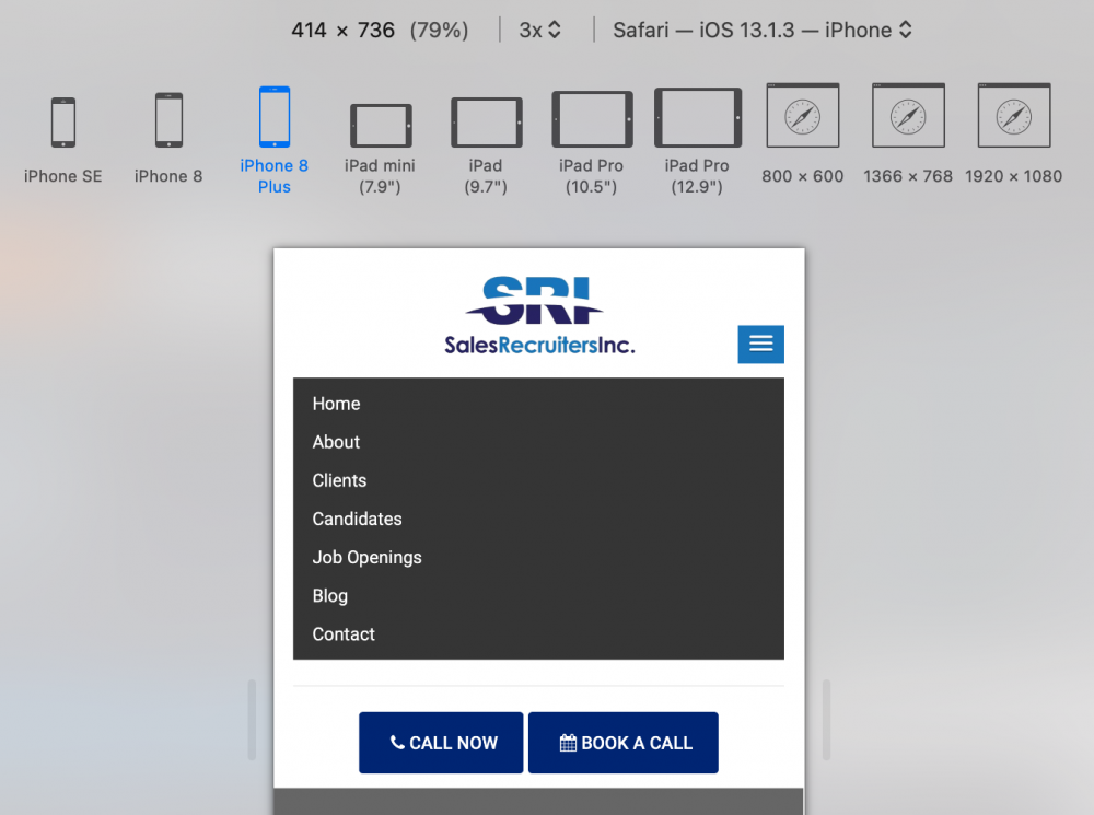
So the cost and benefit of mobile-friendly websites are apparent, and worth the investment to upgrade your websites to meet the new trend of mobility, but what does it really mean to be mobile-friendly? According to Google, it means that your website should not use website plugins not commonly found on mobile phones. For example Adobe Flash which is a discontinued multimedia software platform used for production of animations and required users to install the plugin for the flash file to be visible. Another requirement is the website must use plain text that can be read without having to zoom in like you would if for example your text and articles were in one giant image containing all your text. Also auto adjusting website designs is required so users don’t have to rotate their screen or zoom. The site should auto adjust to every screen size wither in portrait view or horizontal view. A alternative mobile-friendly menu that only appears on mobile as a a drop down or slide out so it is easy to navigate the website.
Google also provides a “Mobile Friendly Test” website to see if your website is mobile-friendly…
URL: https://search.google.com/test/mobile-friendly